Introducing Beefree’s new, accessible default theme
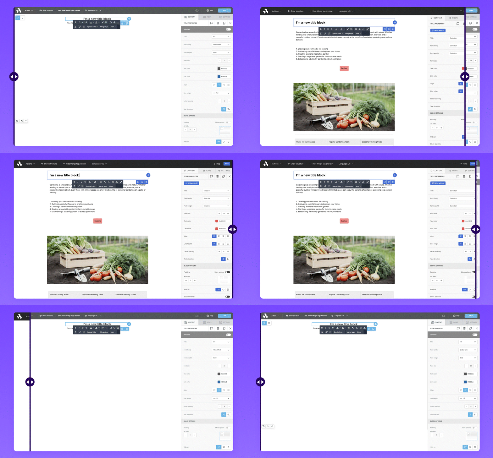
Accessibility is a topic we care deeply about here at Beefree, and as part of our ongoing commitment to make the Beefree Builder accessible to everyone, we’re updating Beefree’s Default Theme to use higher-contrast colors.
ALL PLANS

Important dates
All plans without a Custom Theme will be automatically migrated to the new, accessible Default Theme on November 6, 2025 (or November 13 for all Enterprise applications).
Please check out the docs for more information about this change and how it might affect your integration.
Customize the editor to match your brand
Did you know that the Beefree SDK gives you full control over the editor’s look and feel so you can match your app’s design? Here’s how you can make sure the editor feels like a native part of your product:

CORE PLANS AND ABOVE
Build your own color theme
With our Custom Themes, you can decide which brand colors and fonts you’d like to use in the editor UI to make sure the editor fits seamlessly into your application.
SUPERPOWERS AND ABOVE
Fully customize the editor’s look with Custom CSS
Go beyond simple color and font changes and control every aspect of the editor’s design with Custom CSS. Whether you want to use custom content block icons, hide sidebar elements, or make other more advanced adjustments, Custom CSS gives you the flexibility you need to fully make the UI look native.
Explore Beefree SDK’s advanced customization options today
Your current Beefree SDK plan doesn’t include our advanced design customization options, but we’re happy to set you up with a free proof of concept so you can explore them (and all of the other powerful features our more advanced plans have to offer.)
If you're curious to learn more, just reply to this email.
Your partner in content creation,
The Beefree SDK Team